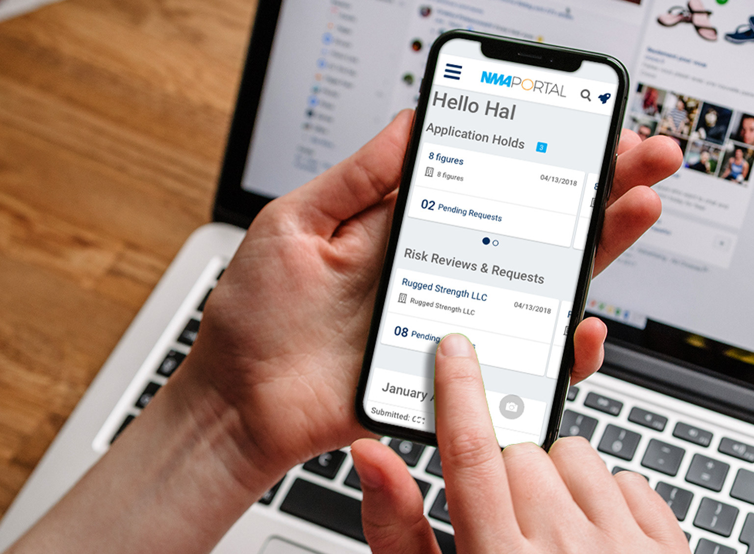
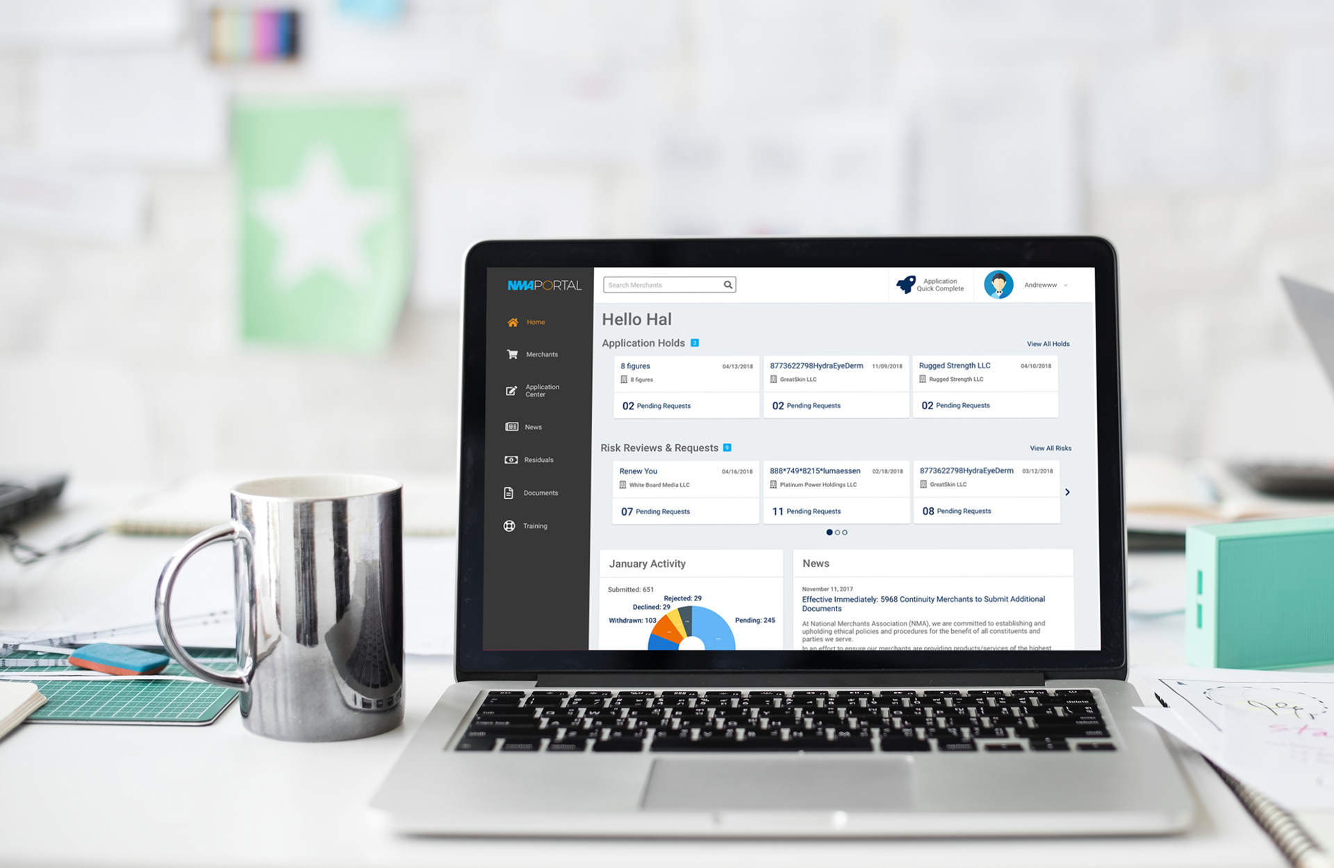
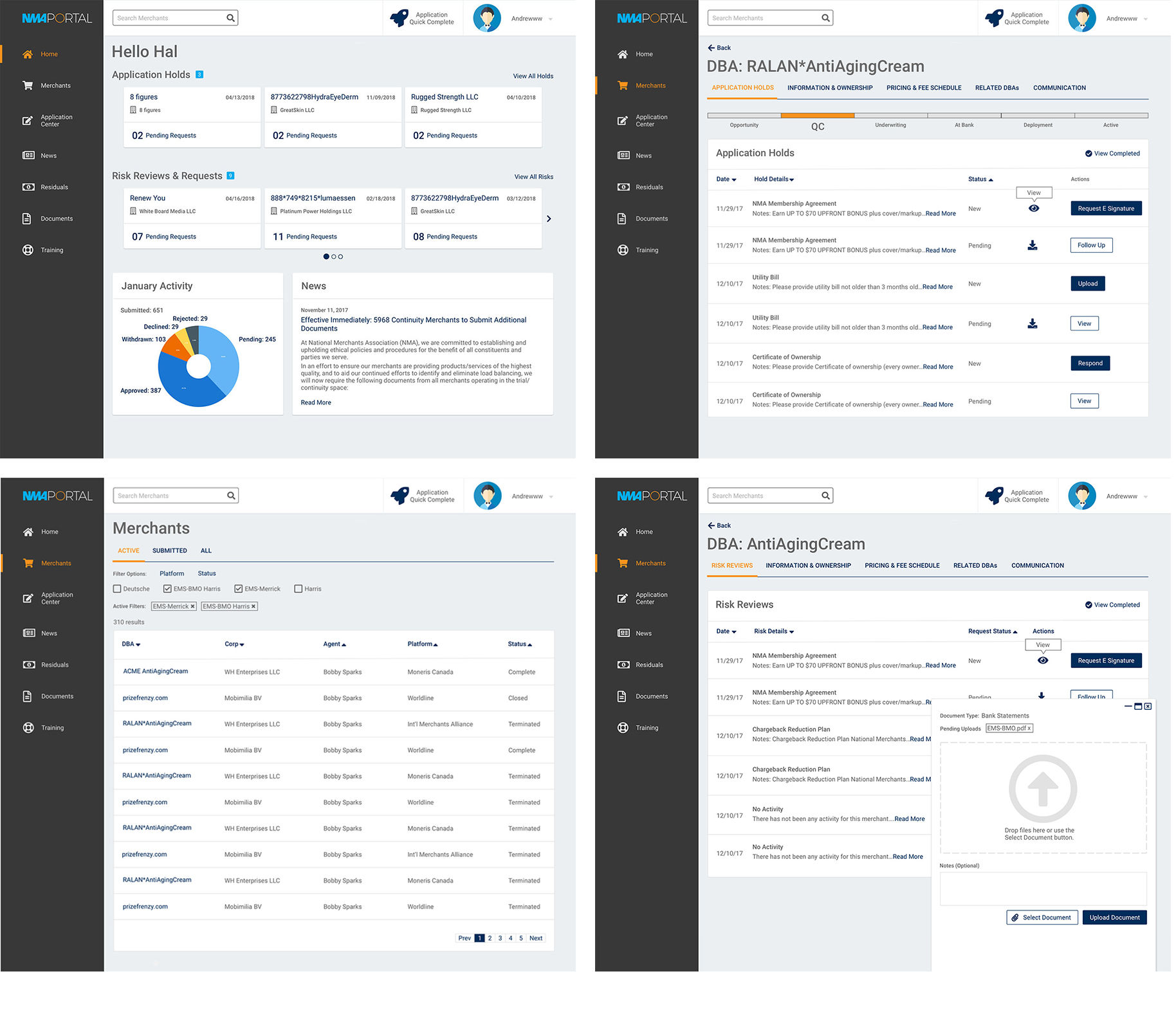
Agent Portal is a CRM tool for sales agents to manage existing merchants and recruit new ones. Agents use the portal to see how much they're earning, which merchants need more attention and the application status for new merchants.
How can I improve the users experience and streamline their workflow without creating a steep learning curve?
The original portal was built by developers without considering user experience. The portal was going to be moved to a faster more efficient platform, so I wanted to use this opportunity to improve the design and streamline workflows. I also wanted to find pain points and latent user needs.
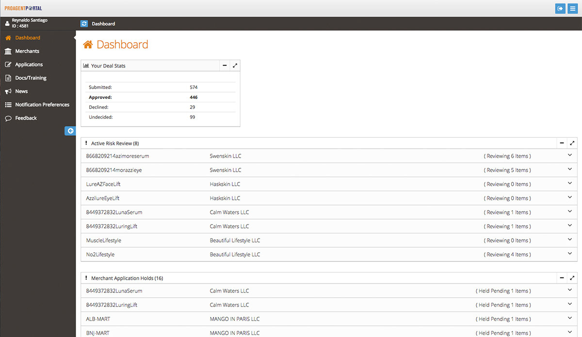
The original design wasn't very engaging. It was cumbersome and contained extremely long scrolling pages.
Users & Audience
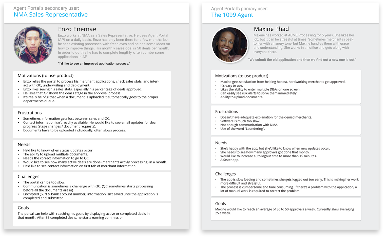
The primary users were sales agents. They were either company employees or off-site contractors. The portal was primarily used by them, but it was also used by sales support, who were there to assist agents with any problems or questions with their accounts.
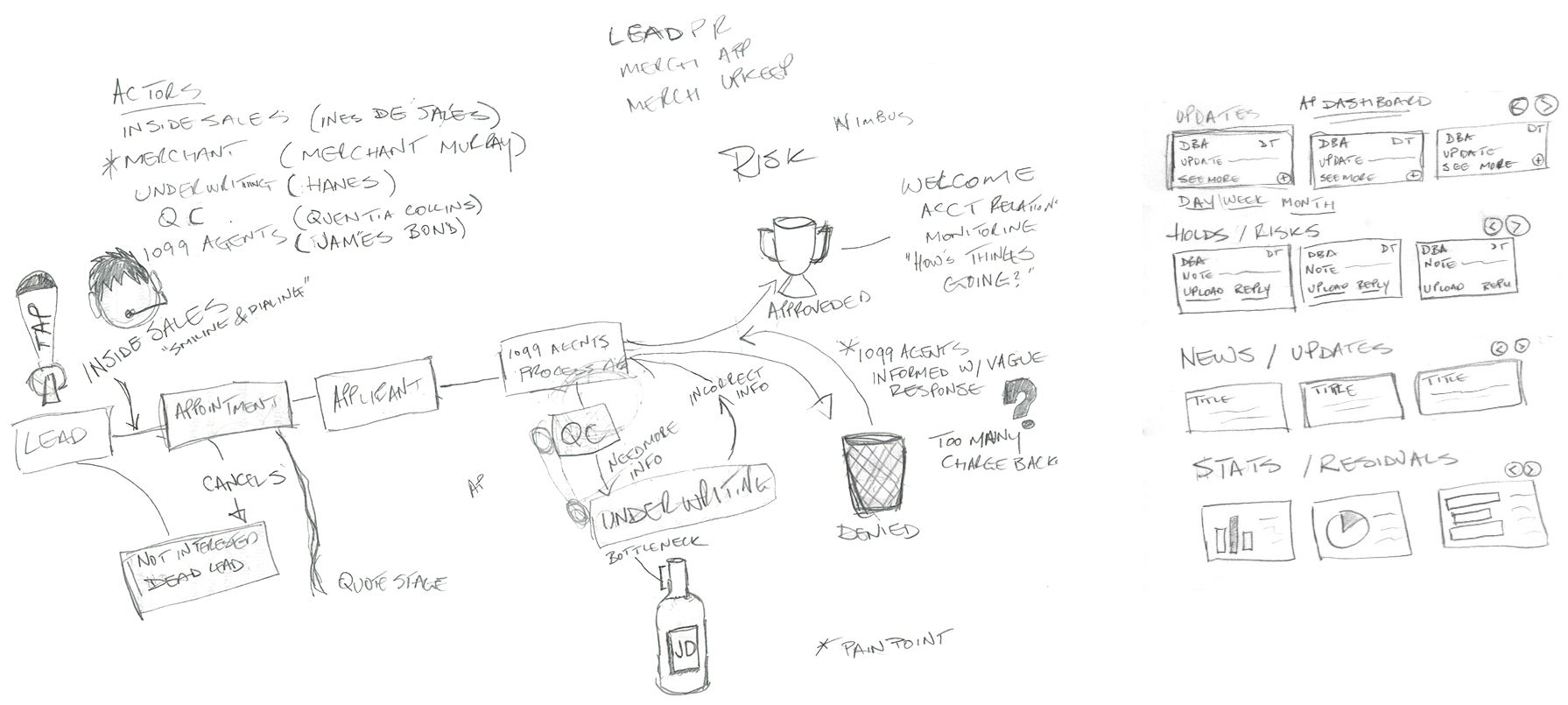
To gain a deeper understanding of the agents' workflow and challenges, I interviewed remote agents via Google Hangouts. As for in-house agents, I sat with them and asked questions as they worked.
I documented my finding and created personas for the different types of agents.
Some questions I asked were:
- "What tasks do you perform most often in the portal?"
- "How do you handle application holds?"
- "What are your sales goals?"
"We verbally told the merchants what we need to process their application."
- Katie R., Inside Sales
- Katie R., Inside Sales
Roles & Responsibilities
As lead UX designer and researcher, my responsibility was to:
- Write interview questions
- Conduct user and stakeholder interviews
- Document and synthesize findings
- Create the user flows
- Create wireframes
- Conduct A/B testing
- Build high-fidelity mockups
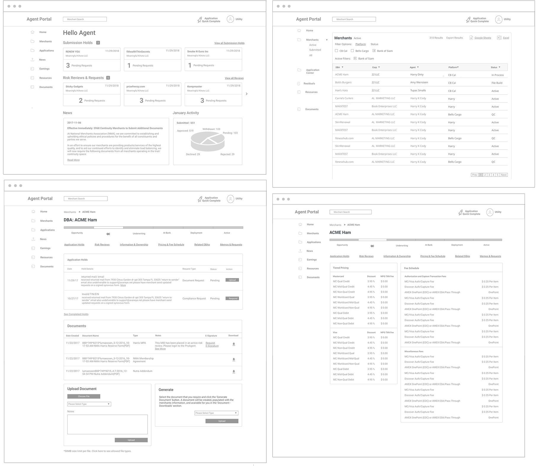
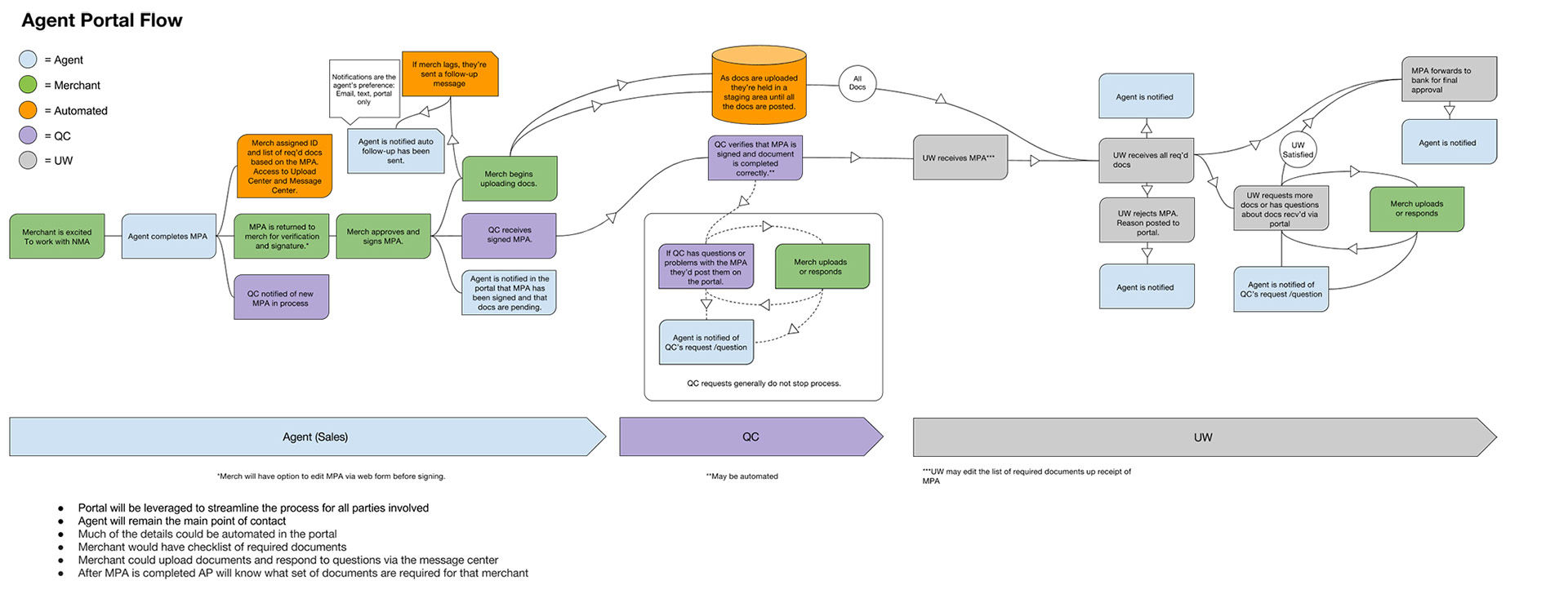
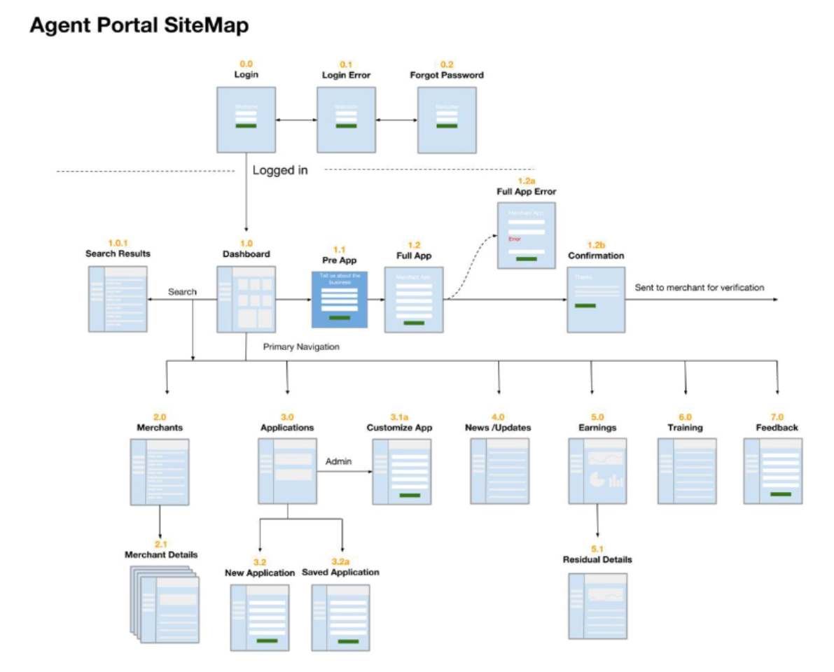
Agent Portal wireframes.
Agent Portal Team
There was seven of us in the development team. We were all remote. Most of us were in California, while some were in India.
Scope & Constraints
The goal was to have a beta version completed by October to showcase at the industry conference. When the project started, part of the scope was to streamline the merchant application process, but unbeknownst to me , we'd been talking to a third-party vendor to handle this. My focus shifted from the Application Process to the dashboard.
Process
I worked in 3-week sprints. Every 2 weeks I presented my work to my direct report and our PM presented it to the stakeholders. I user-tested my designs as often as possible before they went into production. I scheduled periodic design presentations to developers so that they can plan how to implement or improve on my designs.
Outcome & Lessons
Unfortunately, the NMA's product development team suffered major cutbacks before the project could be shipped. Some parts were built, but the bulk of the designs remained prototypes. However, stakeholders were thrilled with the mockups and interactive prototypes.
Many of the stakeholders were actively involved in the redesign. Their input was noted and usually, but not always implemented. Therefore, they felt a sense of ownership in the product, which was part of the goal from the beginning.
Valuable lessons were learned:
- Make sure to exhaust all possible solutions to a problem before moving on.
- Don't consider any design decision as trivial. Some features may seem trivial, but if they're not well thought-out they may backfire on you.
- Don't underestimate the value of quality user feedback and solid teamwork.