
Introduction and Project Overview
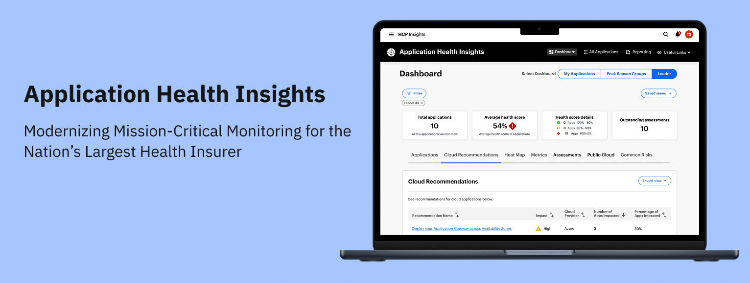
Application Health Insights (AHI)
AHI is an internal web app that gives Optum engineers a single place to track the health of their applications. Each app gets a score based on stability, security, and performance, and AHI shows what’s driving that score and what needs attention. Leadership also gets a clean portfolio view so they can spot risks and prioritize work.
My Role
As the Principal UX Designer and sole design resource for this project, I led the end-to-end product strategy and execution. My responsibilities spanned the entire lifecycle, including generative research, technical documentation, and user interviews.
To ensure seamless integration with the engineering team and avoid the "siloed designer" trap, I embedded myself into the Agile process.
This included:
- Active Participation in Daily Stand-ups: Maintaining constant visibility into development velocity and addressing immediate blockers.
- Backlog Grooming & Refinement: Partnering with Product and Engineering to provide design clarity and ensure user stories were technically feasible and well-defined.
Constraints
- Aggressive timeline: The MVP needed to be live by October 2023, just ahead of Peak Season enrollment, which compressed discovery, design, and validation into a tight window.
- Limited engineering overlap: Development partners were distributed across Ireland and India, reducing synchronous collaboration time and requiring highly structured communication.
- Challenging user access: Recruiting participants for interviews and usability testing proved difficult, so I leveraged analytics to identify the most active AHI users and targeted them for rapid feedback cycles.
- Product ownership volatility: AHI transitioned through three different PMs during the project. Each change introduced new expectations and alignment work, though ultimately each transition improved clarity and momentum.
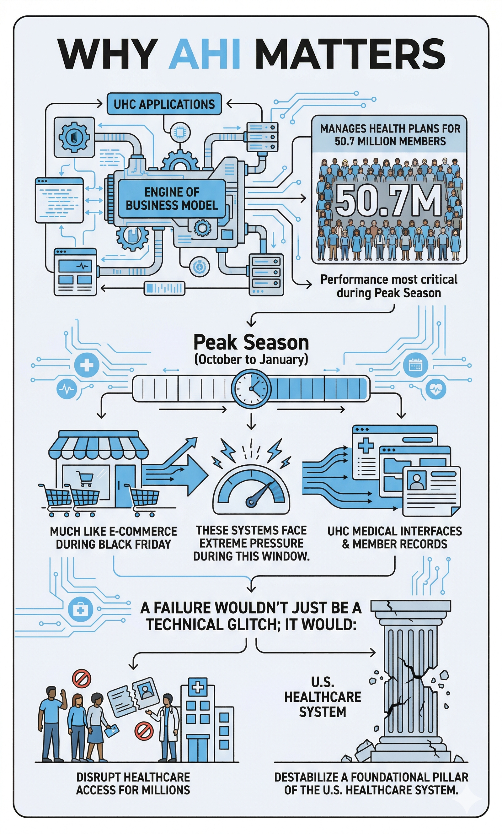
Business Motivation
AHI was modernized to align legacy systems with enterprise standards through three core pillars:
- Design Consistency: Adopting Optum design patterns to ensure a unified UI, reducing cognitive load and onboarding time.
- Technical Optimization: Replacing fragmented code with a scalable architecture to reduce latency and improve long-term maintainability.
- Operational Excellence: Streamlining workflows to remove friction, significantly increasing employee productivity and daily throughput.
Impact
The Problem
I was brought in to lead the complete overhaul of UnitedHealth's critical system monitoring, replacing the legacy Health Assessment Dashboard (HAD) with the next-generation Application Health Insights (AHI) platform.
Pain Points
1. Extreme Cognitive Load: There are at least seven different types of charts and three navigation layers visible simultaneously. A user doesn't know where to look first.
2. The score is our primary metric, yet it lacks the visual prominence to stand out from the rest.
3. Prime real estate is wasted on secondary metrics that aren't being used.
4. Useful visualization but it’s not showing enough time to be useful.
User Research & Discovery
Research Methods
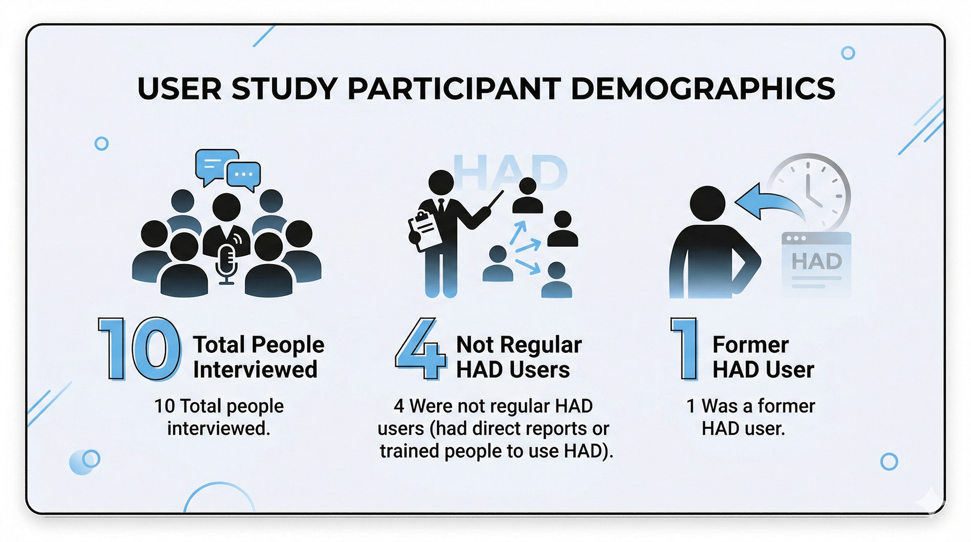
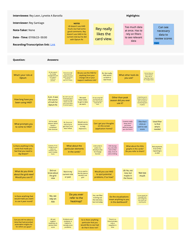
I interviewed 10 HAD users through screen-sharing walkthroughs to ensure the AHI transition preserved their most critical workflows. I focused on non-leading, conversational questioning, adopting a semi-structured approach to uncover deeper insights beyond a rigid protocol. After personally analyzing the session recordings, I synthesized the data and presented actionable findings to the team to guide our design strategy.
Key Findings
- Many HAD users are new.
- They must resort or refilter views when returning to the dashboard.
- Consolidating information or tools came up a few times.
Surprises
- Despite application health’s confusing interface, users didn’t complain about it, nor did they find it difficult to use.
- Exporting reports was an unexpected topic.
- Users only use one or two of the visualizations on the dashboard or none at all.

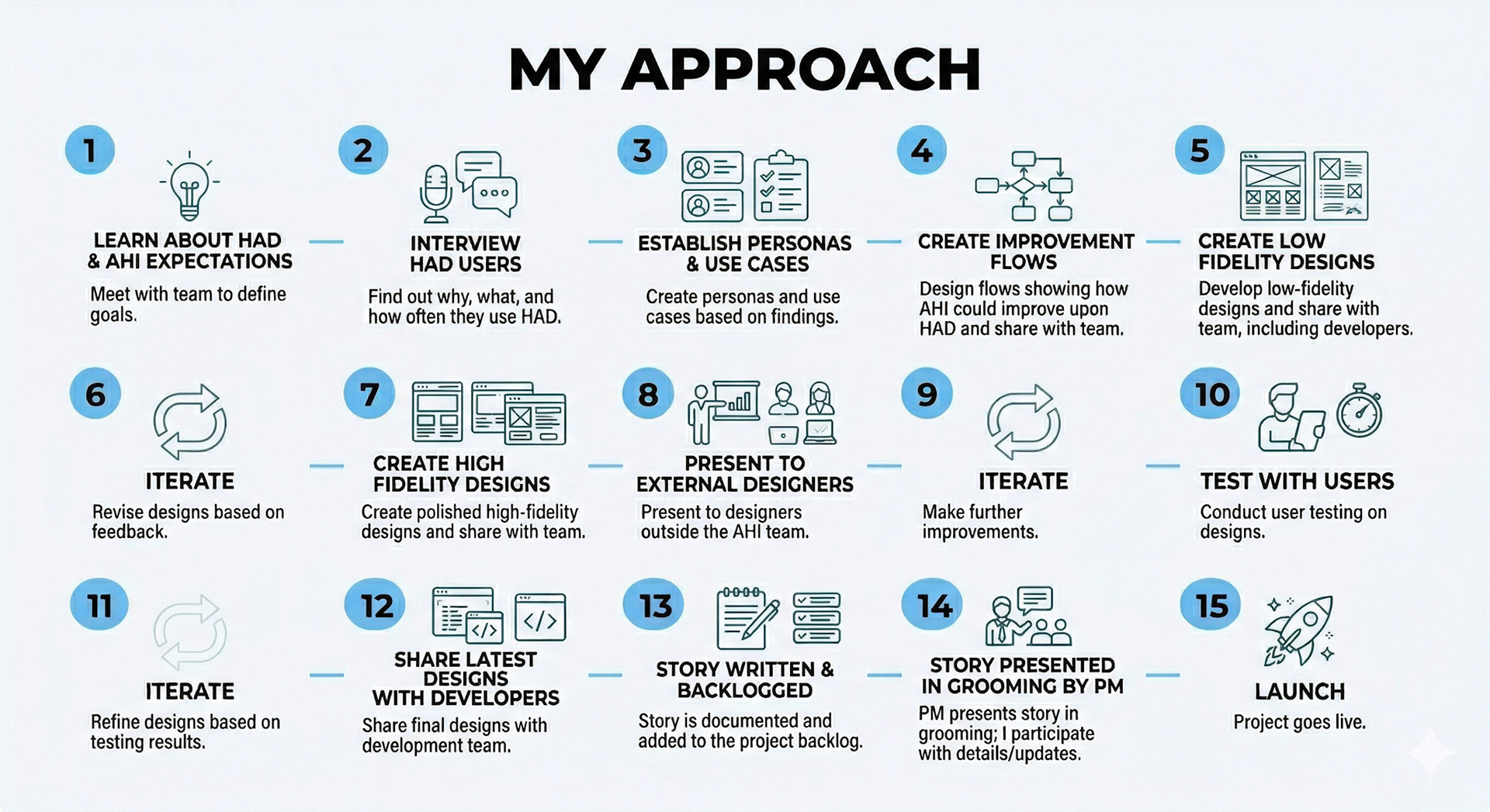
The Design Process
Flows
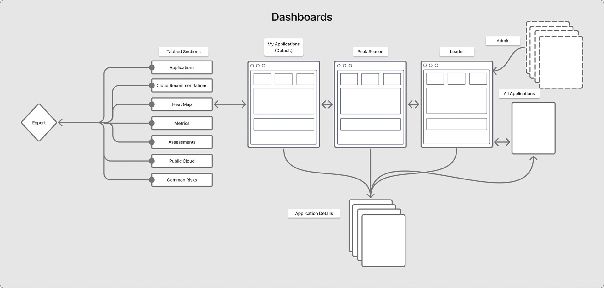
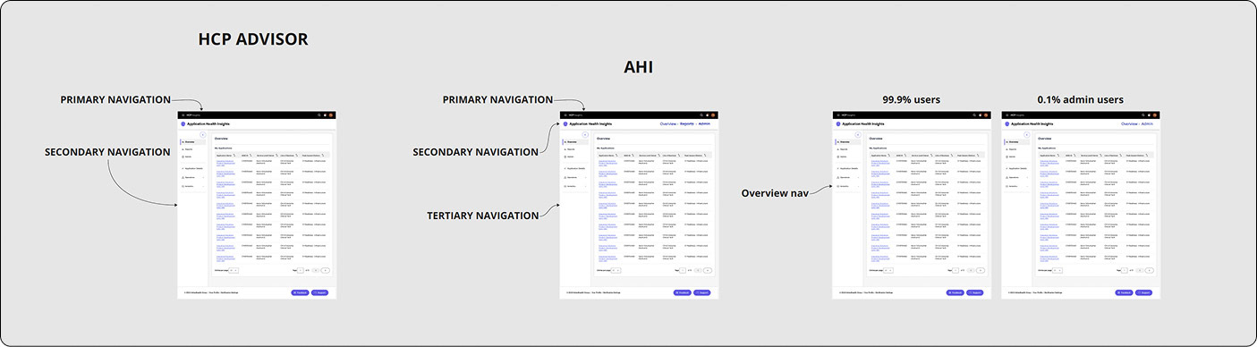
System Architecture: Navigational Strategy
⛔ Problem
How can we create an efficient way for users to navigate data across 14,000 system applications while maintaining consistency with existing Optum UX patterns and minimizing the learning curve for both new and veteran users? and something that’s scalable
✅ Solution
I adapted the Health Assessment Dashboard (HAD) pattern instead of creating a novel UI. With this decision, I traded the ability to link anywhere in AHI for a more logical, easier-to-understand architecture.
The Logic
- Risk Reduction: Using an established internal standard eliminated training time for veteran users.
- Scalability: The dual-axis layout (Global Top / Contextual Left) scales from 10 to 14,000+ apps without breaking the UI.
- Operational Clarity: This prioritized grouping apps by leader or team (like CBAs) over "deep-linking" flexibility, making the system less risky to ship and easier to manage at scale.
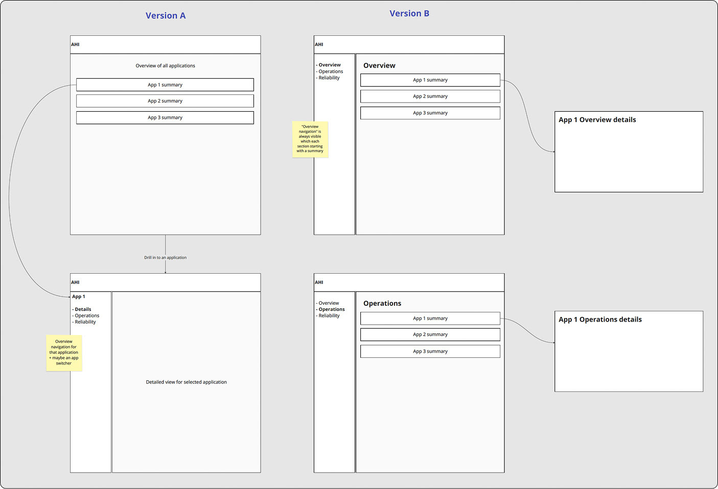
Version A: Contextual Drill-Down (Legacy-Aligned)
- Strategy: Maintain parity with the legacy HAD system to minimize cognitive load.
- Outcome: Maximized screen real estate, ideal for high-density dashboard layouts.
Version B: Persistent Left Nav (Org-Standard)
- Strategy: Align with the broader Optum ecosystem for organizational consistency.
- Trade-off: The sidebar constrained horizontal space, compromising the clarity of complex data visualizations.
MVP Testing and Iteration
MVP Fell Flat
- Users depended on the HAD dashboard as their primary workflow, using it to identify risk, track trends, and report to leadership. Removing it in the AHI MVP eliminated the core value of the tool and forced users back into ASK, where filters don’t persist and reporting becomes manual and fragmented.
- Critical capabilities were missing in the MVP, including leadership‑level filtering (L3–L7), visible health scores, persistent global search, and actionable risk details like “date first found” and pillar‑level breakdowns. These gaps made it impossible for SRE analysts and LOB leaders to assess readiness or explain score changes, preventing AHI from replacing HAD in operational workflows.
Dashboard Evolution
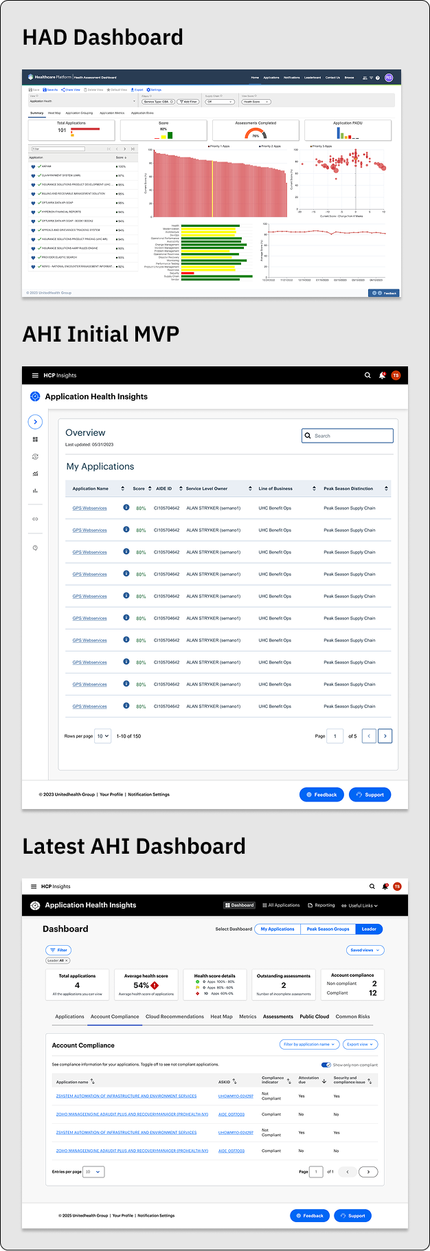
1. The Legacy State: HAD Dashboard
The original Health Assessment Dashboard (HAD) suffered from a "wall of data" problem. While it was rich in information, it lacked a clear visual hierarchy, leading to high cognitive load for engineers.
- The Challenge: Information was fragmented across disparate charts, making it difficult to identify the "signal" within the noise.
- The Goal: Simplify the entry point while maintaining the depth of data required for technical troubleshooting.
2. The Bridge: AHI MVP
Transitioning to Application Health Insights (AHI) required a pragmatic, phased approach. Due to aggressive timelines and backend technical constraints, we launched an MVP (Minimum Viable Product) focused on pure utility.
Strategic Decision: We intentionally stripped back the UI to a clean, searchable table view. This allowed us to migrate users off the legacy system immediately and gather real-world usage data while the more complex visualization engine was being built.
The Result: A stable foundation that prioritized performance and data integrity over aesthetic complexity.
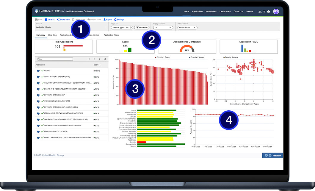
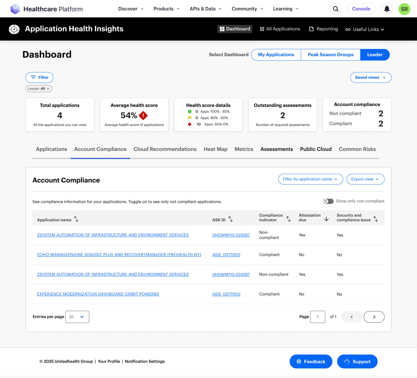
3. The North Star: Latest AHI Dashboard
The current iteration represents the full realization of the AHI vision. We moved from a list-based view to a sophisticated "Overview-First" architecture that empowers engineers to act faster.
KPI At-A-Glance: Integrated high-level metric cards (Total Apps, Health Score, Compliance) to provide an instant pulse check.
Contextual Navigation: Introduced a robust tabbed system—including Account Compliance and Heat Maps—allowing users to pivot between different operational lenses without losing their place.
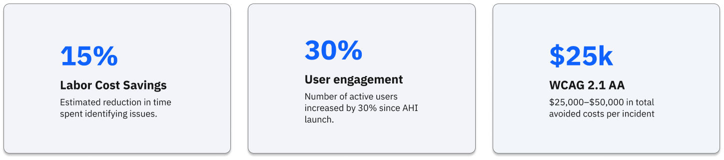
Impact: This evolution contributed to a 30% increase in unique users and a 10% boost in daily engagement, proving that reduced friction leads to higher adoption.
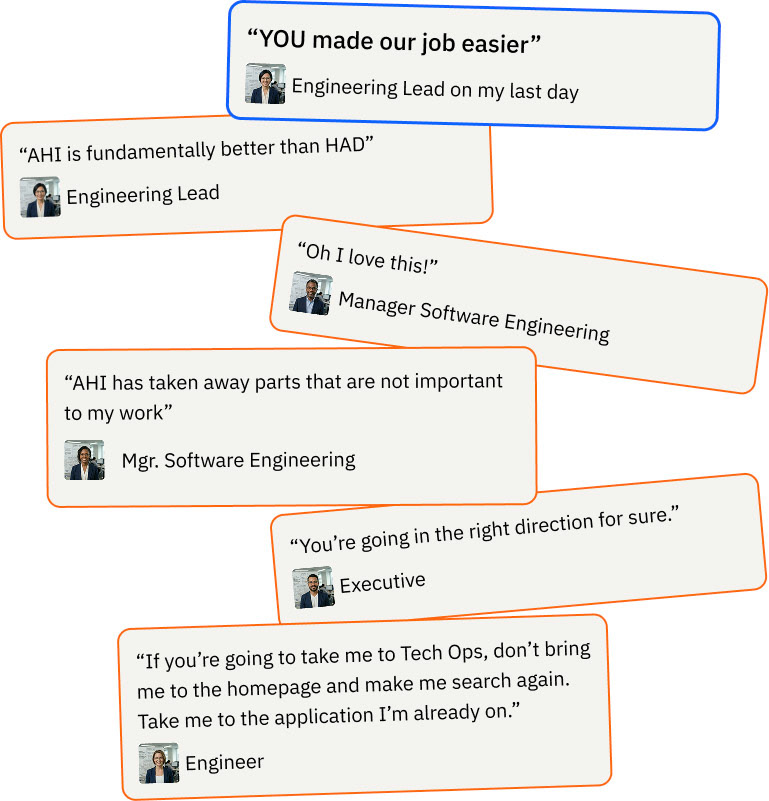
The Finished System and What Users Are Saying
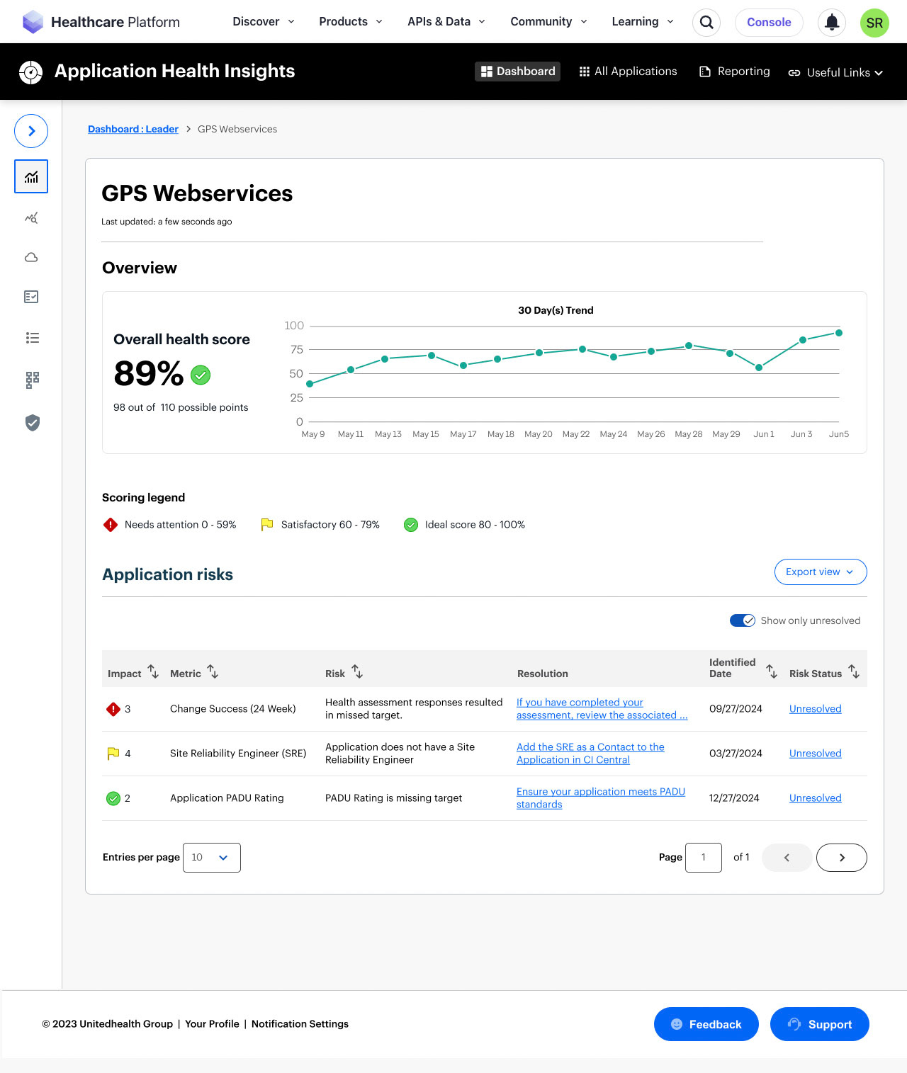
Leader Dashboard
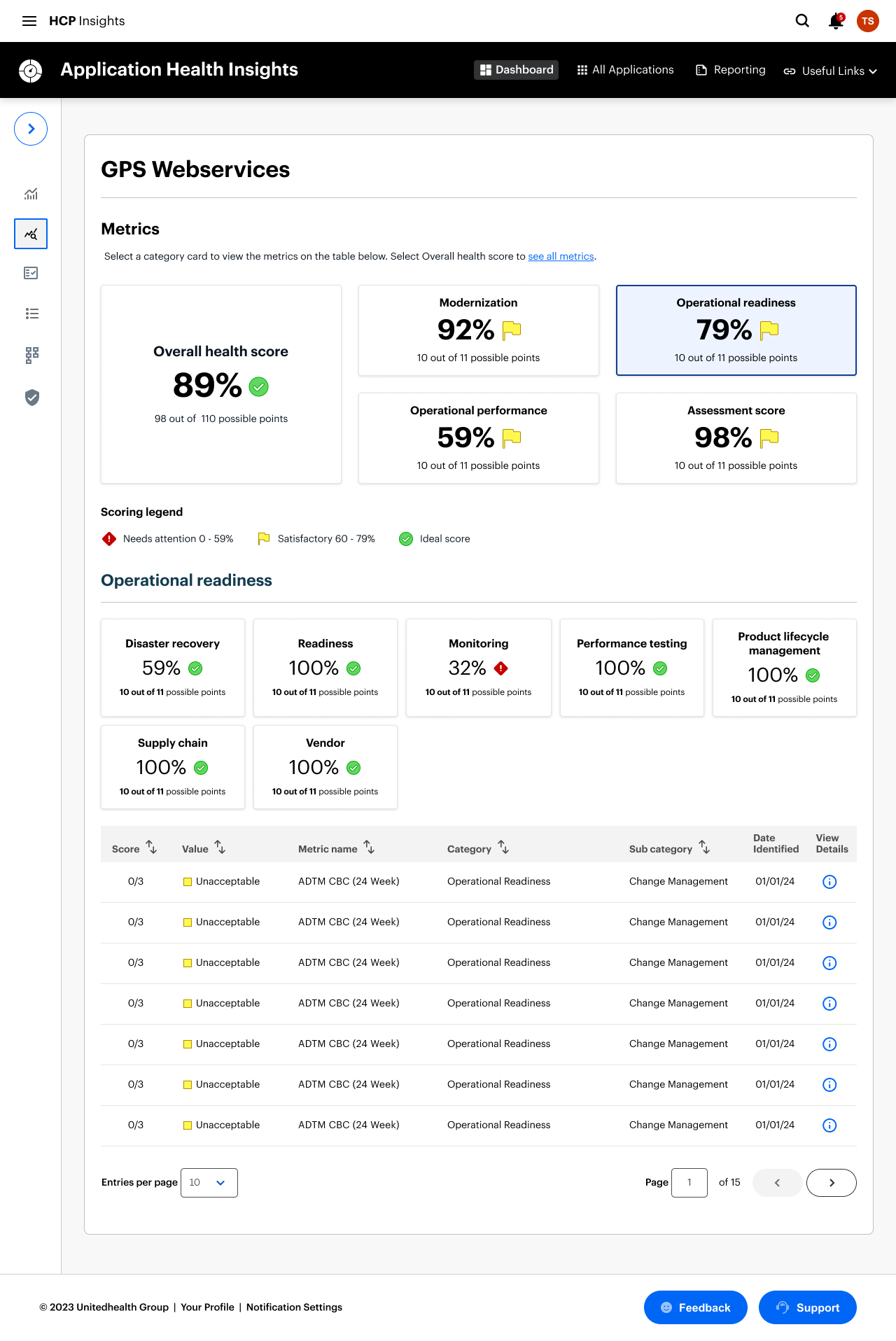
Application Metrics
Application Details
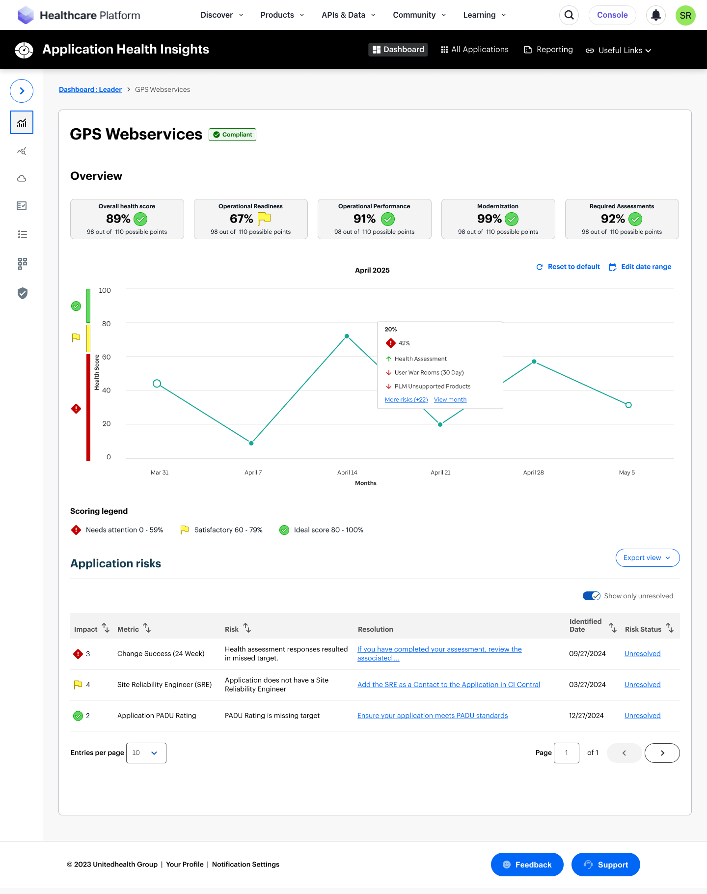
Application Details
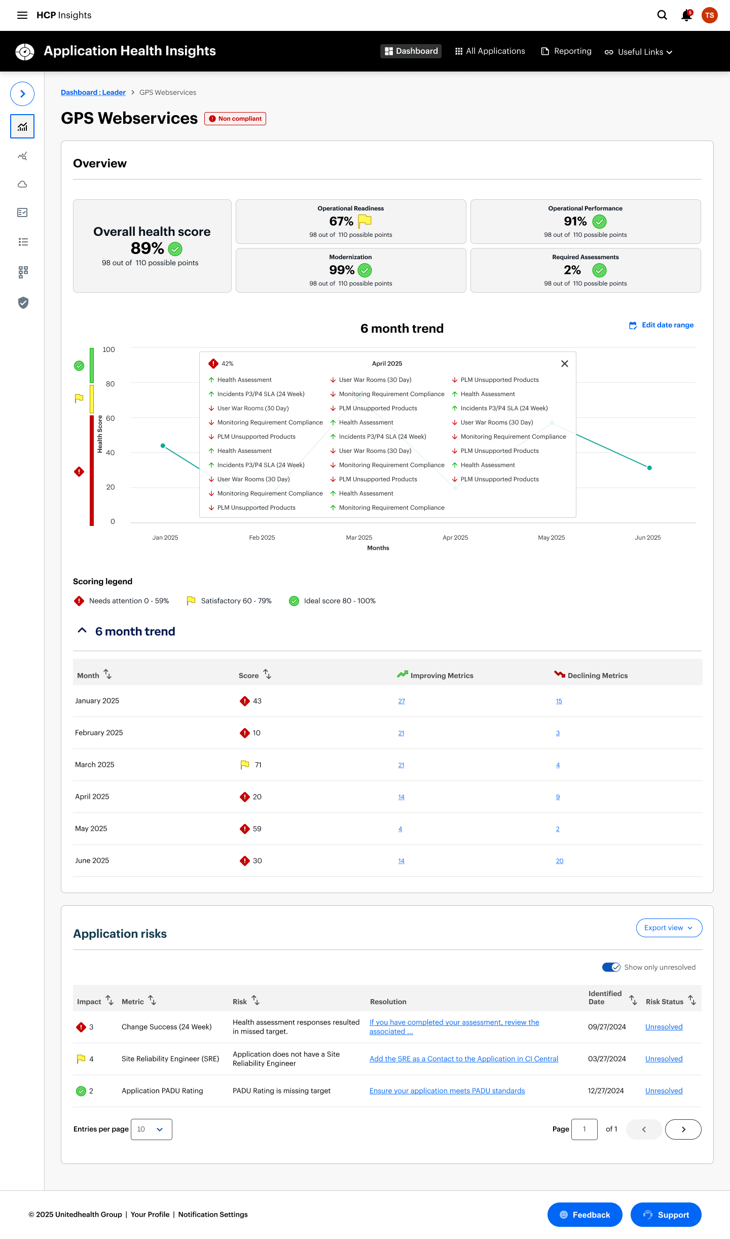
Application Details
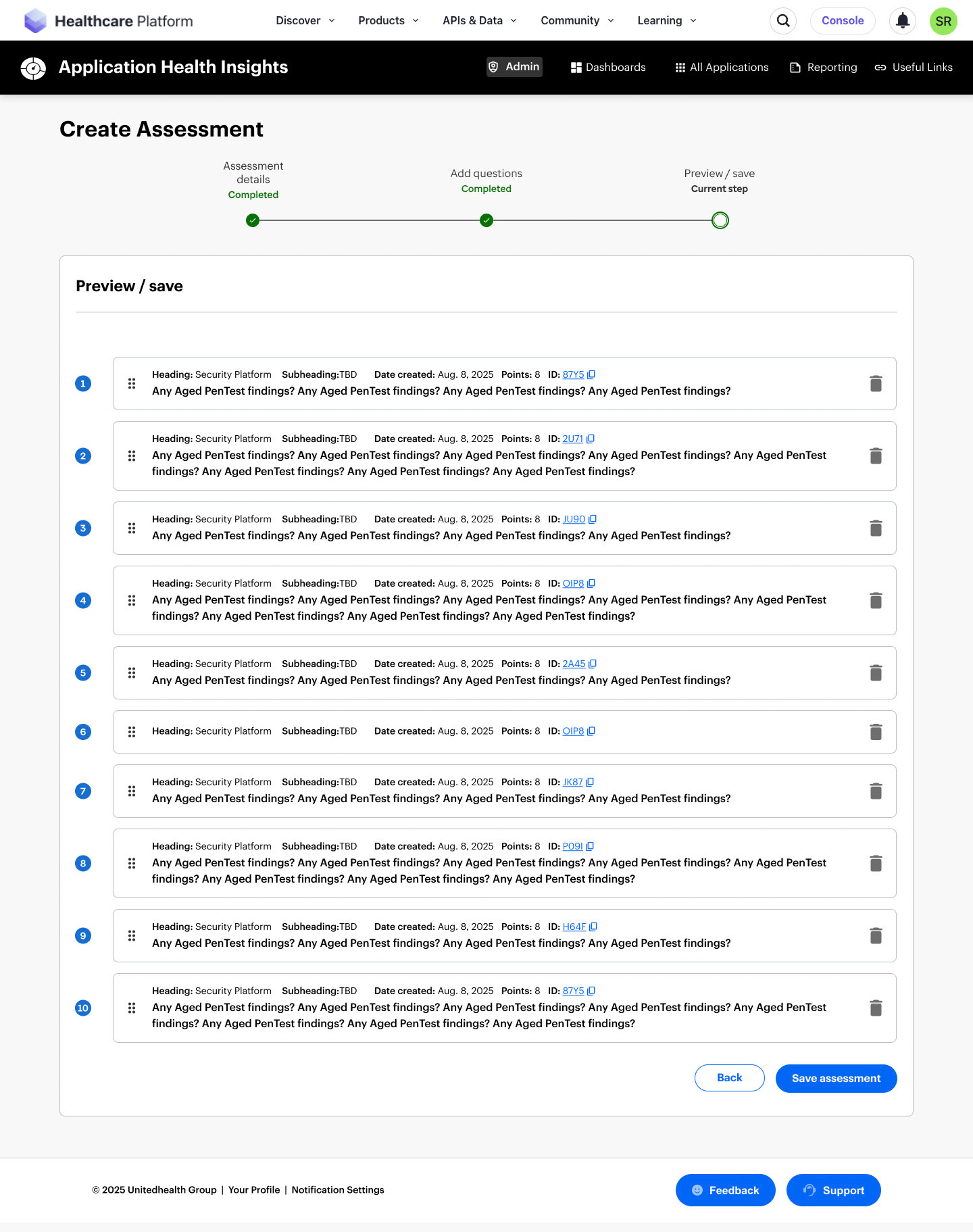
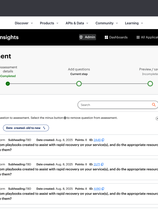
Admin - Create Assessment
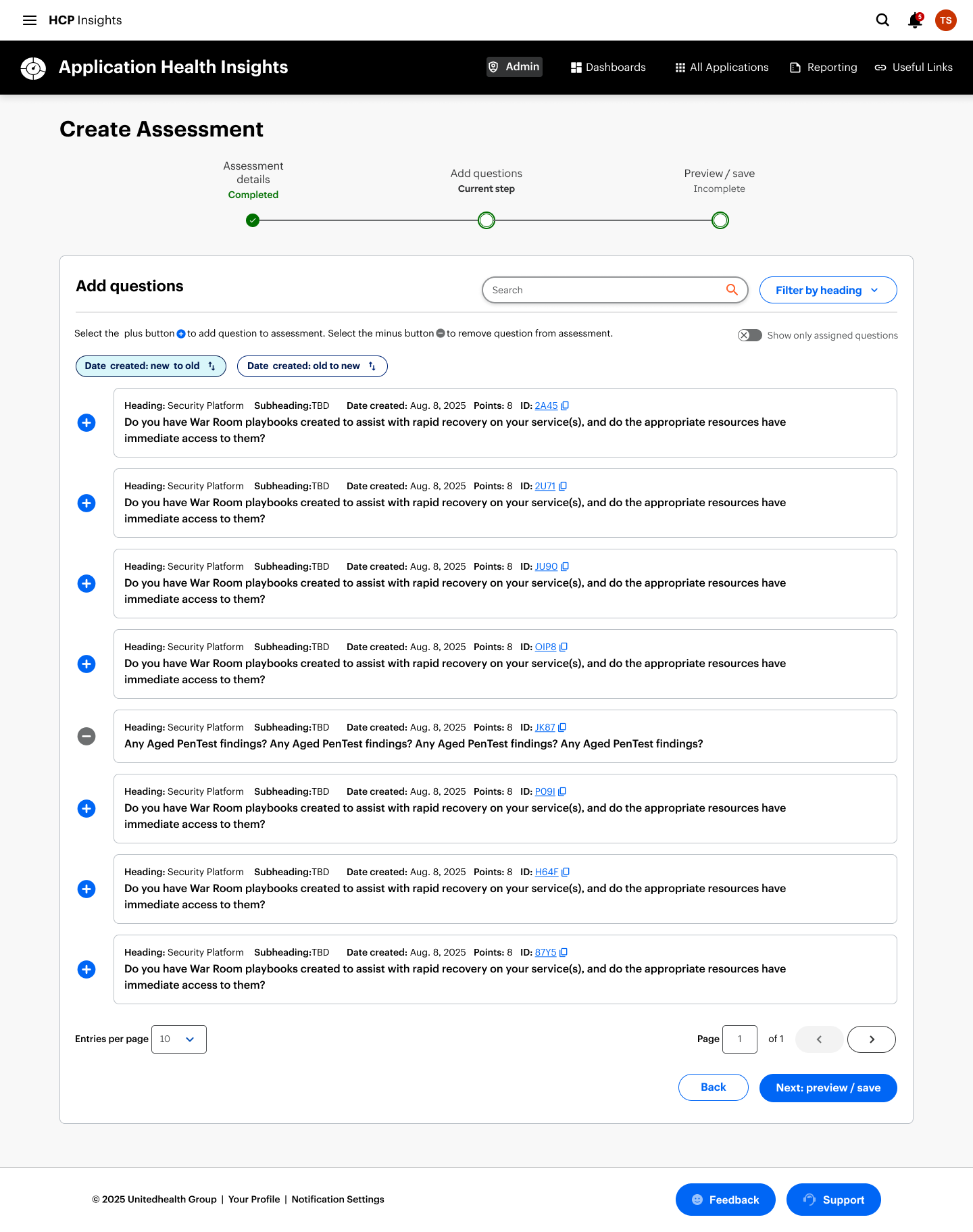
Admin - Create Assessment
Key Learnings and Reflections
1. I became the stabilizing force in a shifting environment.
Navigating multiple PM transitions taught me how to anchor a product vision even when leadership and priorities changed. I learned that my strength is creating clarity fast—using structure, narrative, and systems thinking to keep teams aligned and moving.
2. I thrive in ambiguity when the stakes are high.
The legacy constraints, fragmented personas, and unclear success metrics forced me to turn chaos into a coherent strategy. This project reinforced that I’m at my best when I’m mapping complexity, defining decision frameworks, and shaping a path forward that others can rally around.
3. I would push for earlier alignment on impact
If given more time, I would have driven a shared definition of success earlier—especially around engagement, task completion, and operational efficiency. The experience reminded me that strong design isn’t just about solving problems; it’s about ensuring the organization agrees on which problems matter most.
What's next?
To drive continuous improvement, I’ll keep gathering user feedback and iterating on the experience. One area worth exploring is the introduction of a dedicated homepage. Rather than routing users directly to their dashboard, a homepage could surface new features, highlight relevant updates, and proactively flag potential issues with their applications. That said, this approach must be carefully evaluated—adding an extra click could hinder access to critical data and frequently used tasks.
Given the complexity and richness of information within AHI, there’s significant potential to integrate AI in meaningful ways. From intelligent summarization to predictive insights, AI could enhance usability and elevate the overall value of the platform.